Surface Duo 2 - Review

When Microsoft first unveiled the original Surface Duo back in late 2020, part of me was excited, here was a cool looking piece of hardware, but as it was Microsoft, I had to taper my expectations as their first attempts at new hardware are always underpowered and fail to deliver on the hype, which is why they sometimes never make it to generation two. However, the Duo did and Surface Duo 2 was released late last year and at once, I wanted one, because it seemed to fix most of the issues that people had with the original model, now having spent time with this unique mobile phone, did Microsoft get things right, or is a third attempt needed?
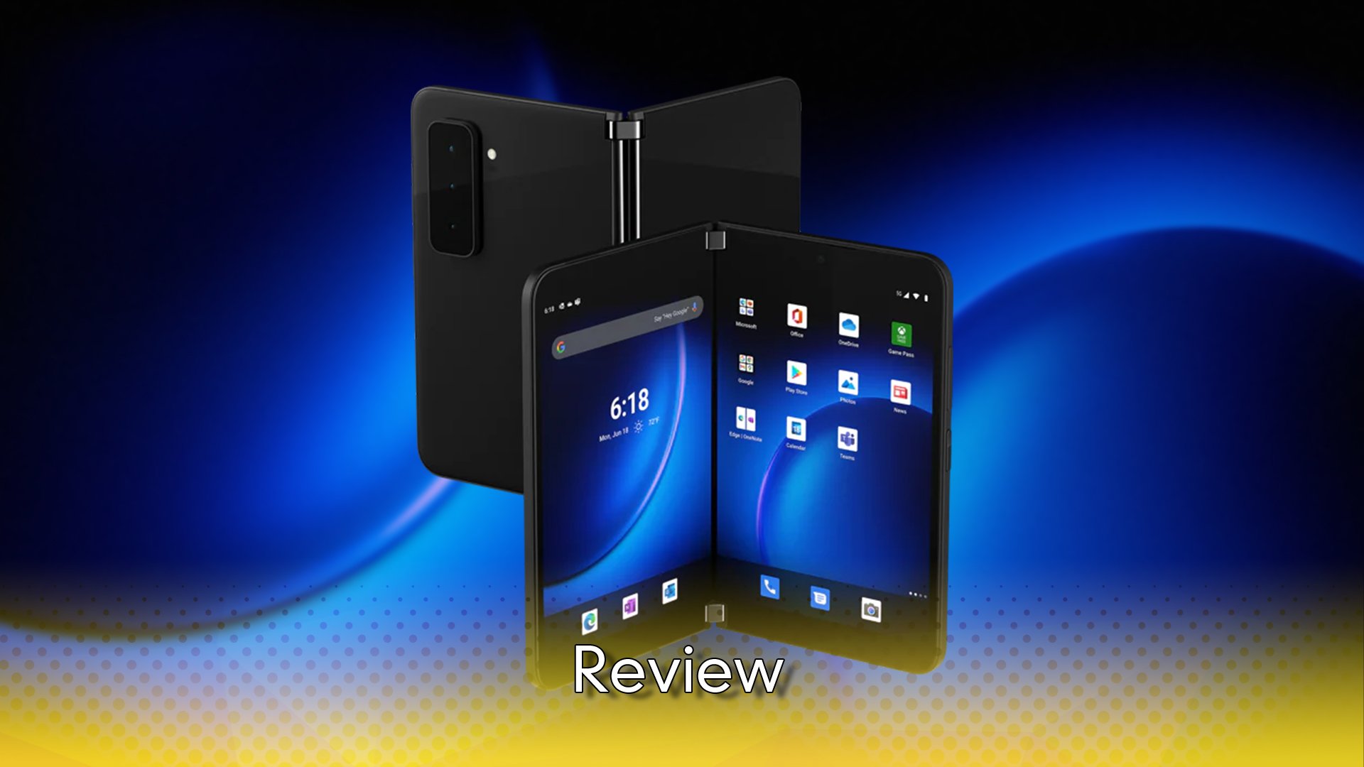
One of the big things with the Surface Duo 2 is that it, like its name implies, has two screens meaning that you can be twice as productive on it, compared to a regular phone. The addition of a second screen though, also means that the phone is much larger than most other phones that are available to buy. Don’t let that be an issue, as the phone folds in half, so if you are worried about the size of your pockets, then you need not be, as when folded, it is only slight wider than the average iPhone. In terms of the design, on the outside there are three buttons, wake/sleep and the volume controls, along with the camera module and the USB-C port for charging, it is very simple in its design. The placement of the buttons is a little off though, the button to wake up the device is just slightly higher than the middle of the device, but the volume is above that, given that I tended to hold the device in a book style, I would have preferred to have the volume functions below the wake button. As far as the camera module goes, it is on the bottom of the device, when it is closed and while it is quite large for a phone, its narrow form factor does suit the Surface Duo 2. If I had to complain about it though, I would have preferred to see it lay horizontally across the device, as opposed to its vertical position now, in order to keep the device level when placed on any surface.
When you open the device, you will find two 5.8inch displays, each delivering a resolution of 1344x1892, which when you expand content to the fullest means you get a display of 8.3inches and its 2688x1892 resolution, making it one of the largest phone displays around. The overall thickness of the device needs to be admired as well, as excluding the camera it is only 5.5mm thick, meaning that once open, it is a very narrow device. Due to the camera module being quite exposed, it does add another 5mm to the thickest point of the device and while not an issue per say, it does look out of place, like someone stuck a magnet to the phone case. Powering the device are two batteries, which with my constant daily use, gave me around two days or just shy of, before I was given the warning to charge it up.
In terms of use, there were a few ways that I made use of it, the common way was like a book, it was a natural way to hold it for me, but the other way I found it useful was to flip one screen around, this turns it into a more single screen device. The single screen method of using it, is basically the same as using a regular phone, so it was handy for those times when I didn’t need anything special from it. The book version was great when I used the Kindle app, but it was also great when I was checking emails, as I could see the emails on one screen, while the inbox on the other. It was also fantastic for checking attachments from the email, that would then open up on the second screen, it seems like such a small thing, but still being able to read the email, while seeing the attachment on the go, was great. Given that after years of being able to multitask on the computer, being able to do it on the go, was game changing and yes, tablet devices like the Microsoft Surface or iPad do allow for that, but being able to do it on a device that can quite literally fold up and fit into a pocket, it is impressive.
The other way that I used the device was flipped around, stacking the screens, as show above and was a great way of making use of the one aspect that I was most interested in exploring, Xbox Cloud Gaming, at least the games that allowed for touch controls. Given that I am an old man now, the moment that I booted into Need for Speed Heat, I flipped the phone around, as if to hold it by one screen and the other was above, it become a Nintendo DS. It had far more power of course and a more recent library of games, but my old man brain, just kept seeing the DS form factor. This is a real blessing because I am so familiar with holding that clamshell design, that I really didn’t have any issues adapting to it, so holding the phone sideways felt right. Having the top screen display the action and then the controls appear on the bottom screen, really just made it feel like I was playing a game on a tv with a controller, where as on my iPhone, the buttons are overlayed on the image.
Need for Speed Heat was not the best game sadly for touch controls, it works perfectly, but as you can’t roll your fingers from one button to the next, like you can on a physical controller, it didn’t allow for some more of the advanced moves the game allows you to employ. Other games though like Golf with friends, Octopath Traveller or Hades worked amazingly well, because they are either slow games, or just allow you to hit single buttons at a time. On my iPhone, I have never really gotten into the Xbox Cloud Gaming, because without a dedicated controller, touch is the only option and it blocks half the image and while the Surface Duo 2 doesn’t allow for the bottom screen to be used as a regular controller, at least right now, it is still way ahead of the curve on single screen phones. Would I suggest to people, that they rush out and buy the Duo 2 as a gaming platform, no, the lack of games that offer touch controls do not number a significant amount and with most of them requiring a separate controller, it makes no sense to get a two-screen device if you are only using one for gaming. There were some games, like Asphalt below, that were enhanced to make use of the two displays, but they were limited in their number aswell.
The gaming is a nice addition to the device, but there are some issues that need to be addressed, the first is the glance bar. Many folks, especially those who make a living on social media, will live and die by their notifications and like any other Android device, they appear on the screen, but with the Duo 2, they also appear on the glance bar. This bar is actually the screens that show when the device is closed, so small strips of the displays are viewable and when you get a text message or a phone call, the notifications appear there. That sounds very handy right, except you can’t tell any other app to appear there, so if you use WhatsApp or play any game that sends notifications, you will have to keep opening the device to see what it is. Now if you have a Google powered watch, you can avoid that, but as a feature glance only works for the basic phone settings, not for any setting and it is something that really needs to be fixed.
The other issue that I found was that you can’t have apps open in full screen by default, there are some apps that do it when you open, but they have been customised for that. There is no system level setting that lets you flag some apps to open on both displays, I basically lived in the Xbox app, but in order to make use of it, I had to open it and then drag it to stretch across both screens. This is not a major issue of course, but when you want to get into an app to do something, like your email, having it open on one, just feels weird and especially so, when it’s a device made for working on, with its dual displays. Both of the issues can be solved with software updates, but they really should have been there from day one, it would be like you buying a car with four doors and only ever being able to open two of them, unless you get in first.
The Surface Duo 2 is an amazing piece of tech, once you get your mind around the screen separation and how it works dragging from one to the other, it feels very smooth. The inclusion of 5G fixes a big complaint from the original device and of course, being able to game anywhere with Xbox Cloud Gaming is a massive boost for anyone who considers themselves a gamer. If you are someone who doesn’t need the ability to multitask on a phone, then this likely isn’t the device for you, but if you want that or want to game on the go, then this is a phone that is highly recommended.
The Score
8.5
Review unit provided by Microsoft
The Pros
+Gaming on this makes me think of the Nintendo DS, in the best way possible
+The dual-screen setup takes some getting used to, but once you have it, you do so much
The Cons
-The glance bar being locked to just a few apps is a bad call
-The camera bump holds a wonderful camera, but feels out of place on the narrow body


